Our next FREE workshop is on 11/12/24 – Sign up here

Launchpad Reading

Increasing donations for this Reading based charity

The Brief

Finding untapped opportunities

Launchpad had just undertaken a website upgrade which focused primarily on the look and feel of the site. They approached us as they were looking to improve the user experience in order to ultimately engage their target audience more effectively to hit their fundraising targets.

See the work we did on their site

View website
Services

In this project, we included

User Journey Maps

We undertook user journey mapping to understand the key drivers, actions and problems the user might face at each stage so we could identify opportunities and put forward solutions.

User journey maps

UX Design

We coupled brand-faithful UI design with a user-first approach to create designs which were functional, look great but more importantly, drive results

UX design

UX development

The website was built from the ground up using clean, fast code to ensure the user's experience was optimum on every level.

UX development
Launchpad case study image preview
Solution

Understanding the user

We produced 5 separate Neuro User Journey Maps to understand their users’ actions, thoughts, reservations, emotions and barriers at each phase of their journey.

Then after applying a layer of behavioural science, we were able to identify key opportunities and make recommendations.

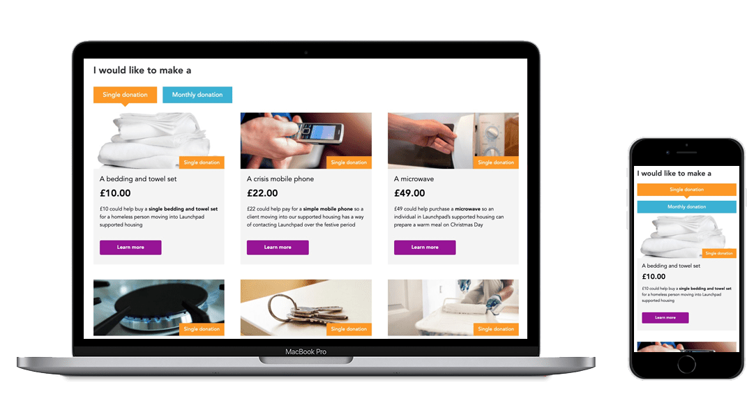
We helped them implement one of the opportunities we identified, in the form of completely reworking their donation page. The idea was that if we could couple a donation amount with a visual representation of what that value was worth to the charity / what it could buy, then not only would it increase donations, it would also increase the value of donations.

The results were immediately apparent to see and the work implemented continues to perform.

Let’s have a chat about your project

And we can help you define the ideal solution

Contact Us

"Our charity had never had the functionality to accept online payments, and OrangeGrove helped us to scope out the options available, and then to implement our choice. The decision was made to roll out before Christmas as part of our Christmas fundraising campaign, and we had very tight deadlines to work to. Orange Grove pulled out all the stops, working with our Marketing and Fundraising Teams to ensure the webpages met our design brief, and had the functionality we needed. Their patience and ability to explain complex processes to lay people was very much appreciated, as was their can do attitude despite the challenges and timing involved. I would highly recommend working with them."

Kirsti Wilson
Head of Marketing & Fundraising

results

Results from the discovery, design and development work

3600%

ROI generated in the first month from their online donations shop

Scale up

Ready to transform your website?

Explore what a SmartSite could mean to you

Tell me more