
Our next FREE workshop is on 11/12/24 – Sign up here

Reading Climate Action Network

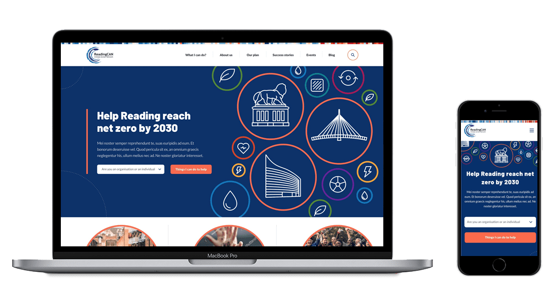
Website redesign to promote and help achieve Reading's climate goals

The Brief

Inspiring action and promoting change

Reading Climate Action Network needed a new website which engaged, inspired and helped individuals, businesses and schools to put the local environmental issues first and work together towards a net zero Reading.

Their previous website simply detailed upcoming events and their overall ‘plan’. So it required a major shift and focus on UX.

See how this website is looking today!

View website
Services

In this project, we included

User Journey Maps

We undertook user journey mapping to understand the key drivers, actions and problems the user might face at each stage so we could identify opportunities and put forward solutions.

User journey maps

SEO Discovery

An SEO discovery phase was undertaken to not only ensure rankings weren't lost in the redesign, but also to identify opportunities to improve them further for greater visibility.

SEO discovery

UX Design

We coupled brand-faithful UI design with a user-first approach to create designs which were functional, look great but more importantly, drive results

UX design

UX Development

The website was built from the ground up using clean, fast code to ensure the user's experience was optimum on every level.

UX development

RCAN case study image preview
Solution

Understanding the user

The discovery phase was vital here to understand the user and their motivations in order to pinpoint a solution which would most likely drive the high engagement and level of action we hoped for from the website. So the first step was to undergo user journey mapping.

As a result of this we identified information chunking would be the most user-friendly method of engaging the audience as it would make the content more digestable and less overwhelming. As such, the website was created around the concept of actionable ‘tips’ for each category, such as travelling and eating & drinking. It was also split out into audience types, so the user could identify the tips that are most relevant to them.

The UX design made use of iconography to help the user identify where they are in the site and to encourage them to browse relevant sections. Reading’s climate stripes were also incorporated to help communicate RCAN’s purpose and support the important work Reading University does on this subject.

Let’s have a chat about your project

And we can help you define the ideal solution

Contact Us

"Initial feedback on the website has been overwhelmingly positive – everyone is very impressed with the design, navigation and content flow. It really sets the tone for Berkshire Maestros as a vibrant, customer focused organisation and showcases the diversity of our offering in a clear and engaging way. We have very much enjoyed working with Orange Grove, and believe that we now have a website that will be much more effective in addressing our strategic objectives."

Helen Bligh
Marketing Manager - Berkshire Maestros

Scale up

Ready to transform your website?

Explore what a SmartSite could mean to you

Tell me more