All websites are wrong, and here’s why

Ok so maybe not all websites, but definitely the vast majority of them. I’ve certainly seen, reviewed and analysed a few in my life.
So what exactly is so wrong with these websites?
They feel more like an advert
Websites are awash with features, benefits and all that jazz. You’re expected to be wowed and enticed by it all.
Like most of the issues outlined, this a classic symptom of not moving with the times. And also one of laziness.
In the pre-information age, selling based on features and benefits used to work on audiences. It was a time when businesses sold secrets. They knew how to do something, and you had to pay them to help if you wanted that done. They sold their products or services based on those secrets.
But, here in the information age there are no secrets. You can find out how to do pretty much anything on Google or YouTube.
In the information age, marketing is about education. It’s about being the best at showing people how to overcome their unique challenges and showing you’re the expert.
The way consumers interact with brands has changed, and websites should no longer be focused on the organisation or the features of the products they’re selling. They should be about the problems your clients are facing and their drivers for finding a product or service like yours. It should be demonstrated how you’re able to help them with all that.
Let’s face it, it’s far easier just to reel off features than doing the work and research to fine out what audiences’ drivers are, but times have changed, and so should websites.
They’re like the worst car salesperson you’ve ever encountered
You know the type; the ones where they don’t listen to you at all, they’re merely working to their own agenda in order to push through sales or enquiries, and that’s all they care about.
We see this all the time. Businesses that started up based on the founder’s passion for their product or service, without having done any research to understand exactly why people might need it.
The result is a website that, at best, makes assumptions about you and why you might want their product or service. Or, at worst, simply makes no assumptions and just directs you to buying or enquiring.
The best websites clearly understand what might be driving you to the website in the first place and after building rapport, make attempts to offer you solutions based on what they understand about you.
The products are then postitioned to meet your needs rather than the quotas of the business.
No effort is made to build trust or rapport with their audience
There’s no effort made to welcome you and make you feel at home, safe and like you belong there.
This is very typical of organisations who believe that getting straight to the point converts the customer better and faster.
But it doesn’t. In fact, psychological research has determined that “People are thirty-times more likely to try a brand if they expect it to deliver strong emotional, identity, social, or functional benefits”.
There’s an expectation you’re there to buy/sign up right there and then
The first call to action you see is “Buy today”, “Enquire now”. And you cry “but I’m not ready to buy or enquire just yet. I’m still researching and getting to know you!”.
According to research commissioned by Vision Direct, 62% of respondents think of themselves as ‘considered’ purchasers – who don’t buy without thoroughly researching the item first, so those CTAs are wasted opportunities to engage or educate.
In fact there’s evidence to show, in relation to retail sites,
The site is suffering from ego-itis
All the copy is talking about them. Whether it’s “we do xyz…” or “we’re the best…” it’s completely organisation-centric, and misses the opportunity to talk to you, the user, on your terms.
Businesses love talking about themselves, some people do too. They’re passionate about their product, and that’s great, but just like “that person” you meet at a networking event, unless they start asking you questions and engaging you in conversation, it’s going to do nothing but put you off.
It’s all take-take-take
All these websites want are your business. There’s nothing given in return. No freebies, no useful information, no helpful insightful content. Can they really expect from us if they’re not willing to give?
There’s no unifying thread that runs through the site
And finally, nothing on the website flows. The experience is jarring. Messaging is all over the place and there’s nothing pleasant about interacting with the site. The brand experience basically sucks.
Storytelling is a lesser-used tactic on websites, but it’s one of the most effective ways of engaging an audience and creating this thread.
If you have a strong narrative that links your brand vision and values, it can be weaved consistently throughout the content across the site, unifying it effectively for your users. But there are other benefits too.
Messages delivered as stories can be up to 22 times more memorable than just the facts.
“When we listen to stories, neural activity increases fivefold—we’re using our motor cortexes and our emotion and visual image processing centers, we’re imagining sensations, and we’re processing emotional reactions. What this means is that more of our brains are at work, so we’re more focused on the story and more likely to retain it later.
(Source: Quantified)
They’re overloading you with too much information
Too many options or too much information and content is going to do nothing but put us off. Not least we can only retain a finite amount of information.
These things take mental energy to process (System 2 – Thinking Fast & Slow by Daniel Kahneman). If it requires too much mental energy or they’re not ready for this part of the decision making process, then they’ll simply give up and go elsewhere.
No one says this more effectively than Barry Schwartz in his Ted talk on the Paradox of Choice.
As a solution, instead of overloading us with content, websites should focus on integral content only as well as looking to chunk it more effectively. Chunking is the process of grouping different information together into more manageable or meaningful chunks. The BBC does this well:
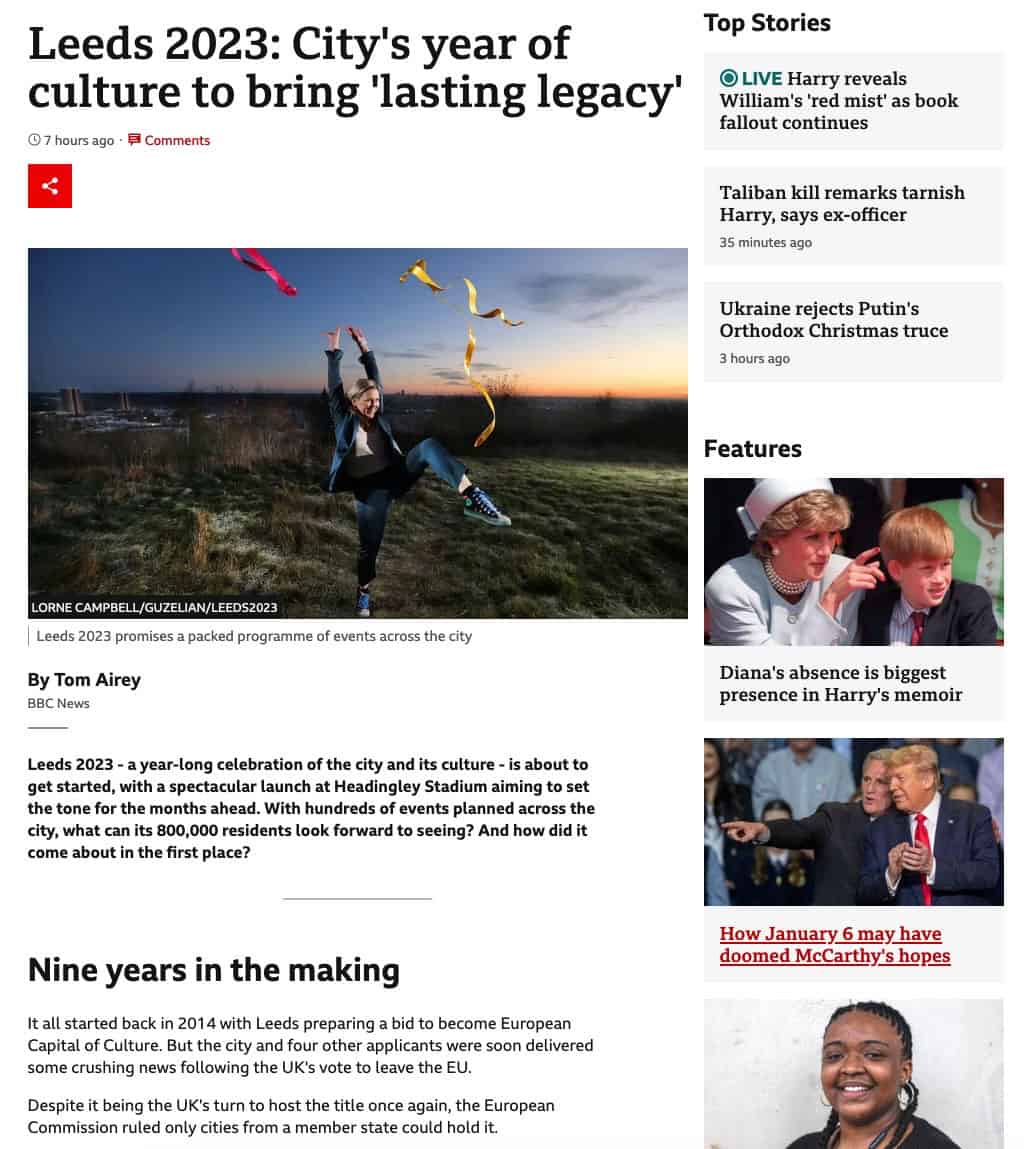
They use short paragraphs, subheadings, summaries, lots of whitespace and horizonal rules, to help us distinguish between sections effectively.